Using R to replicate Sara Silverstein's post at BusinessInsider.com
A first-year student near and dear to my heart at the Kellogg School of Management thought I would be interested in this Business Insider story by Sara Silverstein on Benford’s Law. After sitting through the requisite ad, I became engrossed in Ms. Silverstein’s talk about what that law theoretically is and how it can be applied in financial forensics.
I thought I would try duplicating the demonstration in R.1 This gave me a chance to compare and contrast the generation of combined bar- and line-plots using base R and ggplot2. It also gave me an opportunity to learn how to post RMarkdown output to blogger.
Using base R
Define the Benford Law function using log base 10 and plot the predicted values.benlaw <- function(d) log10(1 + 1 / d)
digits <- 1:9
baseBarplot <- barplot(benlaw(digits), names.arg = digits, xlab = "First Digit",
ylim = c(0, .35))
- That was easy!
- Save the barplot output in an R object so the x-values of the bar centers can be used later in the line plots2
- ylim extends the y-axis to 35% to accomodate the highest line value – eventually – below
firstDigit <- function(x) substr(gsub('[0.]', '', x), 1, 1)pctFirstDigit <- function(x) data.frame(table(firstDigit(x)) / length(x))N <- 1000
set.seed(1234)
x1 <- runif(N, 0, 100)
df1 <- pctFirstDigit(x1)
head(df1)## Var1 Freq
## 1 1 0.108
## 2 2 0.112
## 3 3 0.123
## 4 4 0.097
## 5 5 0.120
## 6 6 0.110lines(x = baseBarplot[,1], y = df1$Freq, col = "red", lwd = 4,
type = "b", pch = 23, cex = 1.5, bg = "red")
- As Ms. Silverstein notes, not much agreement
- Colors are assigned manually in base R
- Base R’s lines function automatically adds lines to the previously generated plot
- Base R allows for both points and lines to be generated in one call to lines via the option type = “b”
- lines arguments are set (e.g., point symbols are “diamonds” with pch = 23) to approximate Ms. Silverstein’s graphs
df2 <- pctFirstDigit(x1^2)
lines(x = baseBarplot[,1], y = df2$Freq, col = "violet", lwd = 4,
      type = "b", pch = 23, cex = 1.5, bg = "violet")
Notice the slight improvement in Benford-conformance.
Next, simulate another 1000 values, divide the square of the first values by these numbers, and add their first-digit frequencies to the plot:
x3 <- runif(N, 0, 100)
df3 <- pctFirstDigit(x1^2 / x3)
lines(x = baseBarplot[,1], y = df3$Freq, col = "blue", lwd = 4,
      type = "b", pch = 23, cex = 1.5, bg = "blue")
Ms. Silverstein: “We’re getting closer!”
Finally, simulate another set of values, multiply them by the result of the previous operation, and add those frequencies to the plot:
x4 <- runif(N, 0, 100)
df4 <- pctFirstDigit(x1^2 / x3 * x4)
lines(x = baseBarplot[,1], y = df4$Freq, col = "green", lwd = 4,
      type = "b", pch = 23, cex = 1.5, bg = "green")
- These plots agree somewhat with those in Ms. Silverstein’s video
- Repeating the exercise with more simulated values (say, N = 100000) gives better results
- A legend would be nice, but legends can be overly tedious in base R!
Using ggplot
In contrast to base R, ggplot relies on a data.frame as the source of data to plot, so store the ‘digits’ and Benford’s predictions in a data.frame, then bar-plot the values with “geom_bar”.library(ggplot2)
df <- data.frame(x = digits, y = benlaw(digits))
ggBarplot <- ggplot(df, aes(x = factor(x), y = y)) + geom_bar(stat = "identity") +
xlab("First Digit") + ylab(NULL)
print(ggBarplot)
- Per typical ggplot2 procedure, save the ggplot results in an R object, here named ‘ggBarplot’, for later use
- “print” the saved object to see the plot
- Use “factor(x)” so the bars are labeled on the x-axis with discrete values rather than with continuous values (the default when x is numeric)
- Since there is only one observation per x value, there is nothing for geom_bar’s default summary statistic, count, to do, so set ‘stat’ equal to “identity” to avoid an error
p1 <- ggBarplot +
  geom_line(data = df1,
            aes(x = Var1, y = Freq, group = 1),
            colour = "red",
            size = 2) +
  geom_point(data = df1,
            aes(x = Var1, y = Freq, group = 1),
            colour = "red",
            size = 4, pch = 23, bg = "red")
p2 <- p1 +
  geom_line(data = df2,
            aes(x = Var1, y = Freq, group = 1),
            colour = "violet",
            size = 2) +
  geom_point(data = df2,
             aes(x = Var1, y = Freq, group = 1),
             colour = "violet",
             size = 4, pch = 23, bg = "violet")
print(p2)
- As with base graphics, manually set the colors of the curves
- Base R’s names for the symbol style (pch) and symbol background color (bg) can be used for ggplot as well
First, bind the frequency columns of the four individual data.frames into one “wide” data.frame. Rename the columns so the eventual legend will be more informative.
DF <- cbind(df1, df2[2], df3[2], df4[2])
names(DF) <- c("FirstDigit", "X1", "X1^2", "X1^2 / X3", "X1^2 / X3 * X4")
head(DF)
## FirstDigit X1 X1^2 X1^2 / X3 X1^2 / X3 * X4 ## 1 1 0.108 0.191 0.327 0.315 ## 2 2 0.112 0.132 0.150 0.163 ## 3 3 0.123 0.135 0.115 0.124 ## 4 4 0.097 0.105 0.096 0.093 ## 5 5 0.120 0.091 0.074 0.088 ## 6 6 0.110 0.091 0.065 0.067Next, use Hadley’s reshape2 package to melt this “wide” data.frame into the “long” format ggplot thrives on.
library(reshape2)
mDF <- melt(DF, id = "FirstDigit", variable.name = "operation")
head(mDF)
## FirstDigit operation value
## 1 1 X1 0.108
## 2 2 X1 0.112
## 3 3 X1 0.123
## 4 4 X1 0.097
## 5 5 X1 0.120
## 6 6 X1 0.110P <- ggBarplot +
geom_line(data = mDF,
aes(x = FirstDigit, y = value, colour = operation, group = operation),
size = 1.5) +
geom_point(data = mDF,
aes(x = FirstDigit, y = value, colour = operation,
group = operation, bg = operation),
size = 4, pch = 23)
print(P)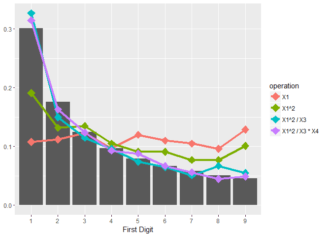
- size and pch are outside the aes call because they are the same for all curves
- bg is inside the aes call because the background colors differ by operation
Conclusion
- The Kellogg student was correct
- Base R’s graphics are more useful for quick, exploratory, “one-off” plots because the syntax is relatively straightforward
- gglot2 is more useful for automated, elegant, presentation-level plots, but the learning curve is more steep
- 1 This topic has been previously explored at http://statistic-on-air.blogspot.com/2011/08/benfords-law-or-first-digit-law.html↩
2 Thanks to https://danganothererror.wordpress.com/2011/01/15/adding-lines-or-points-to-an-existing-barplot/↩
No comments:
Post a Comment